Identity Rebrand
Mercy Flight Central | 2022-2023

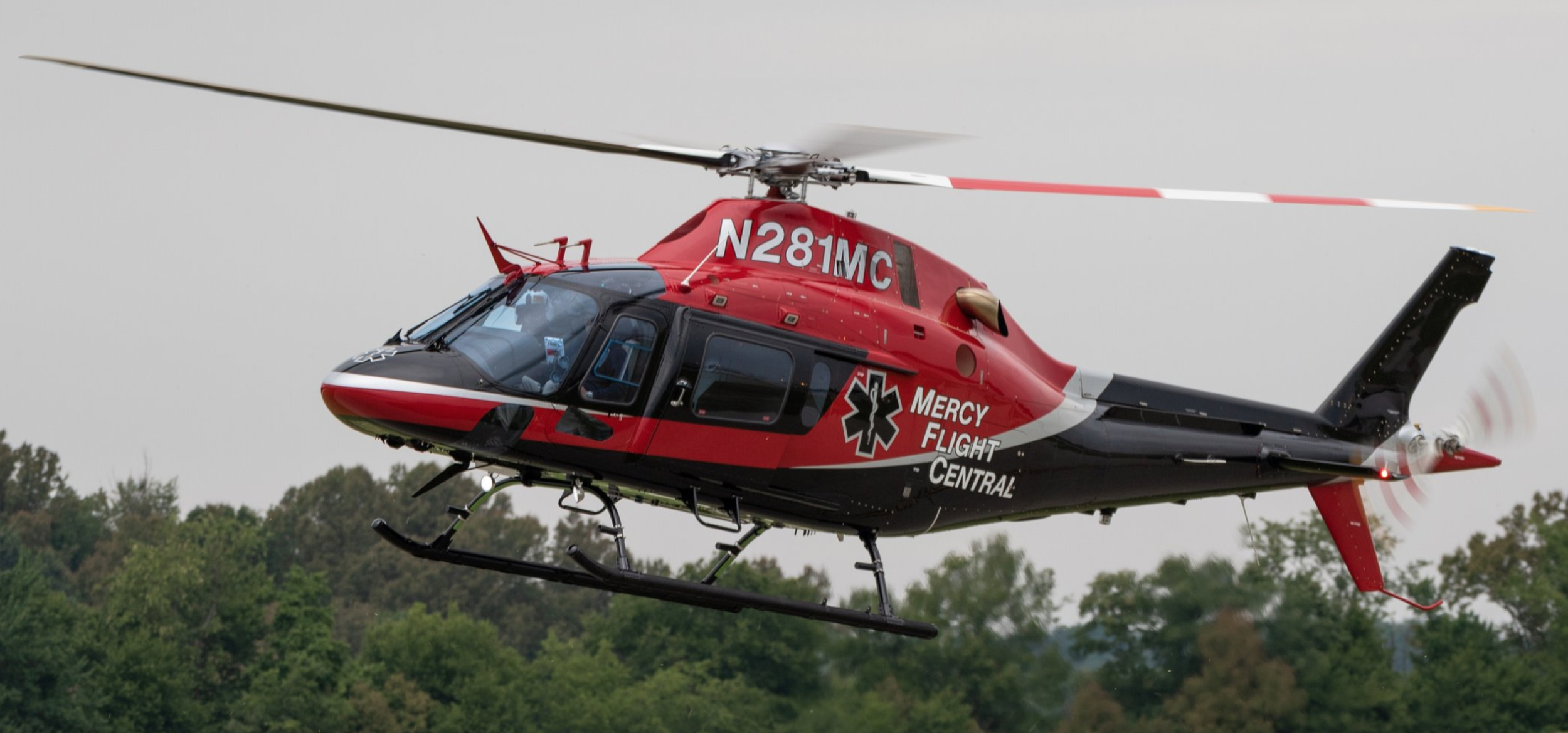
Old Aircraft (BK117)
A New Chapter
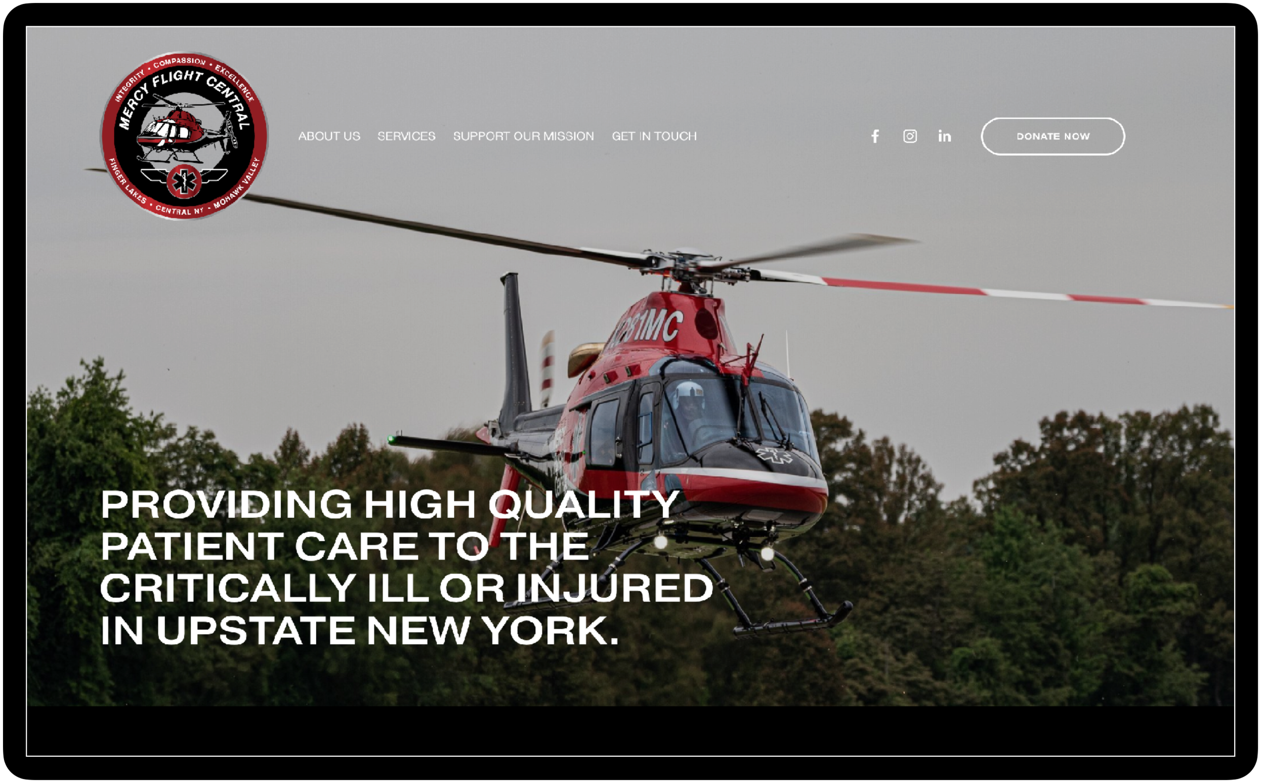
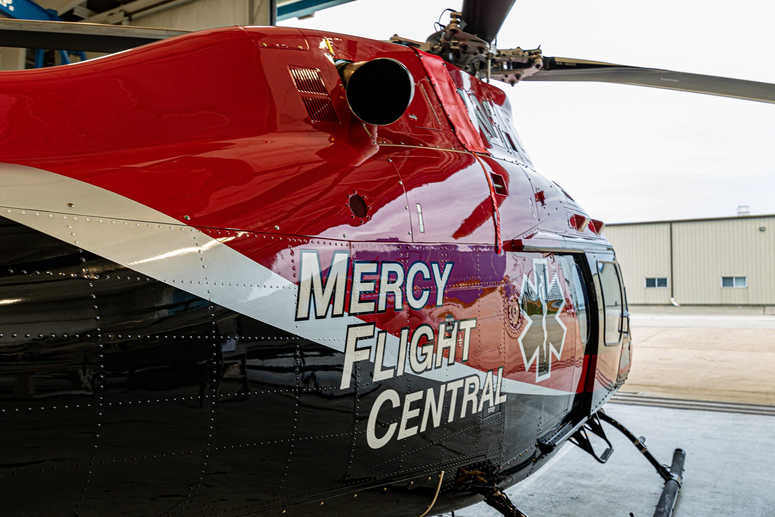
Community non-profit Mercy Flight Central celebrated 30 years of service by replacing their fleet of BK117s with AW119kx.
They sought an identity refresh that was as modern and exciting as their new aircraft while still paying tribute to their heritage and community.
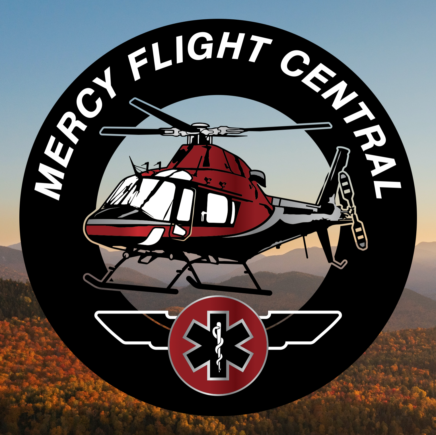
Proud to Serve
Old Branding
The air medical industry is made possible by many different types of heroes, all with various (/impressive) levels of specific training. Pilots, paramedics, nurses, communications specialists & mechanics all play a vital role in each mission, and the rebrand needed to cater to the needs of each stakeholder.
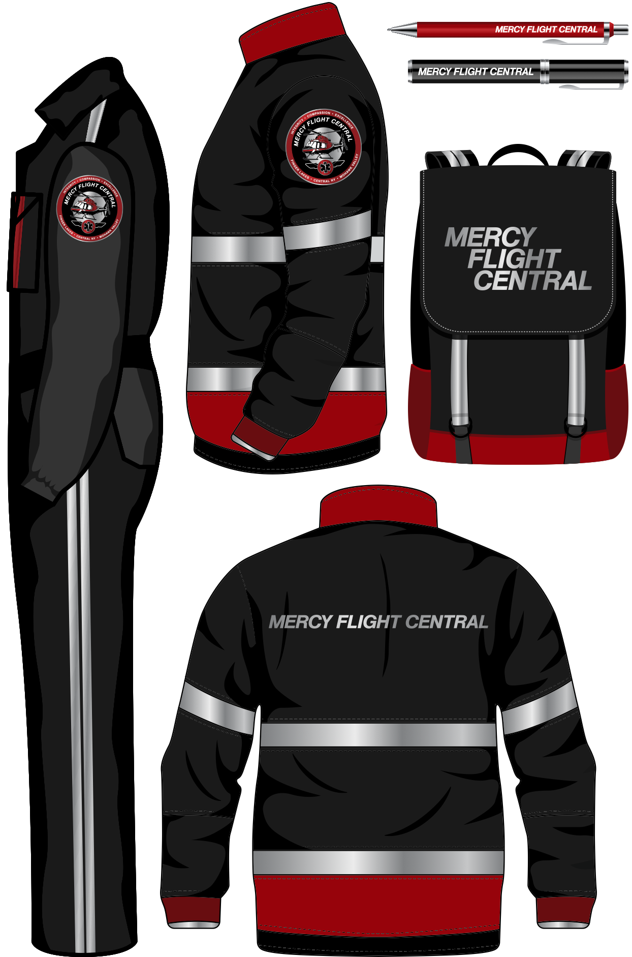
In addition to being the face of the organization in traditional applications, the mark also needed to serve as the crew’s new patch on all gear worn during missions flown in the new aircraft.

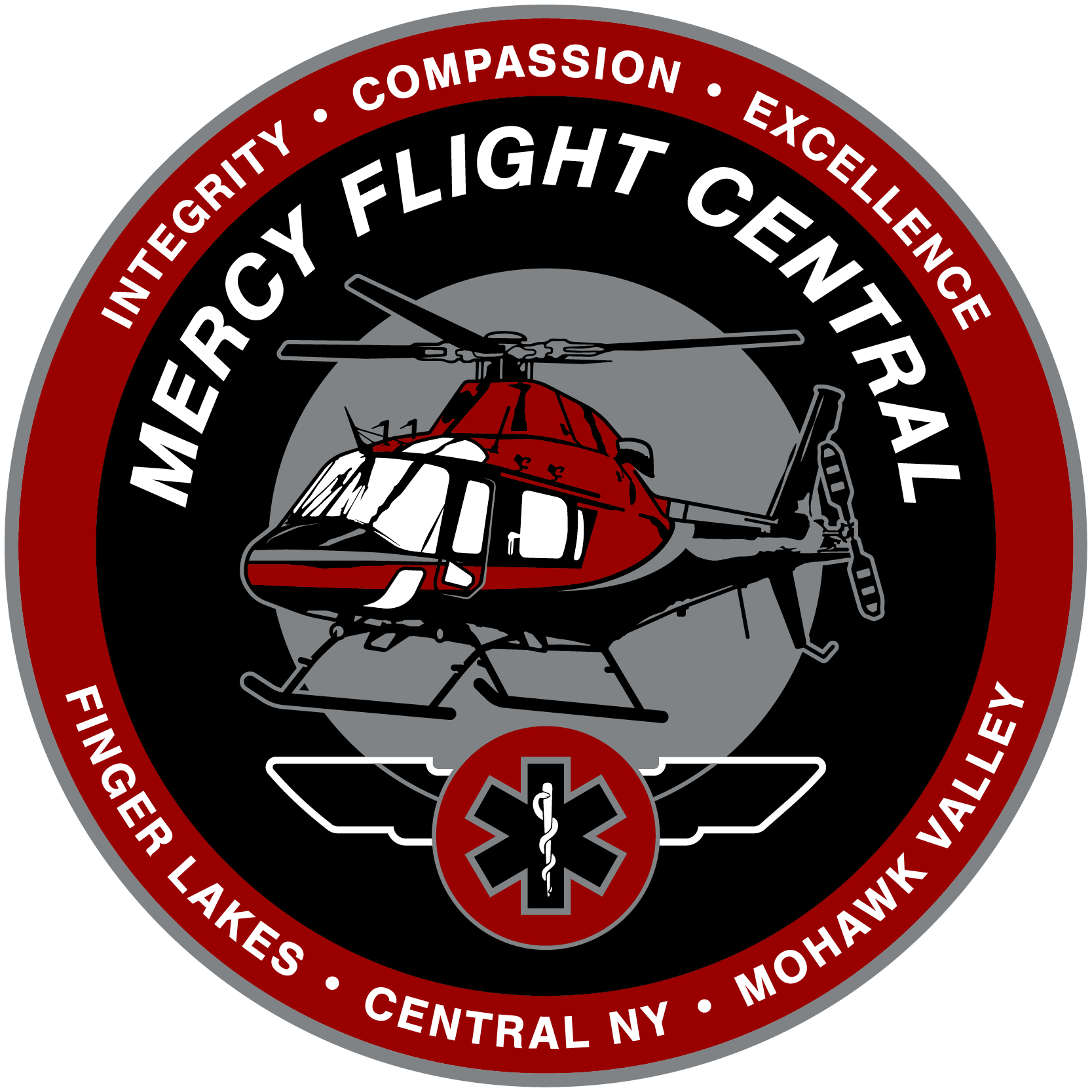
It’s this last point that sparked my direction for Mercy Flight Central’s new mark. Vintage military, aviation, & scout patches all hold the space for the amount of information the logo needed to convey. The shapes found in my research also proved that a flexible design system would be easily achievable with this approach.
New Branding
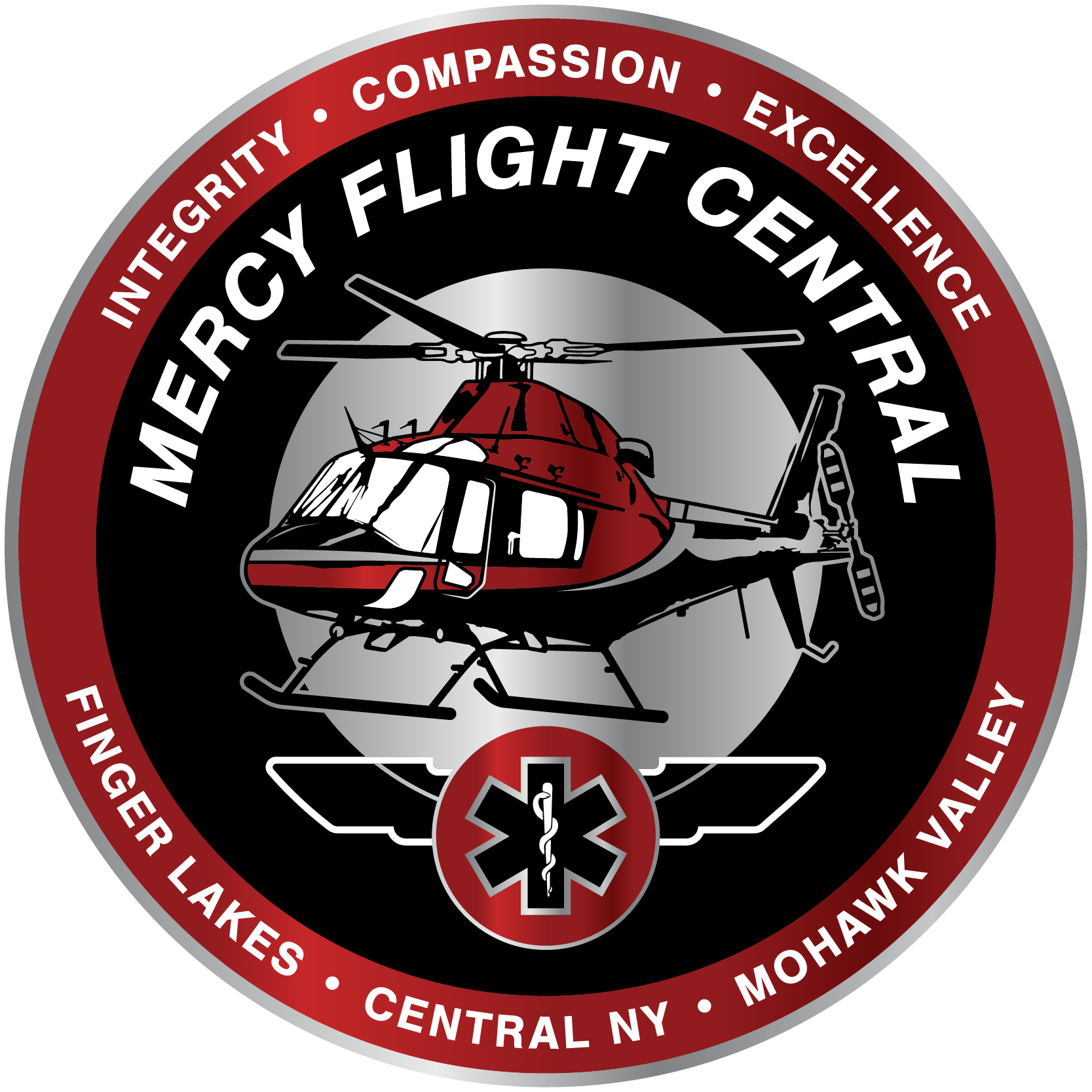
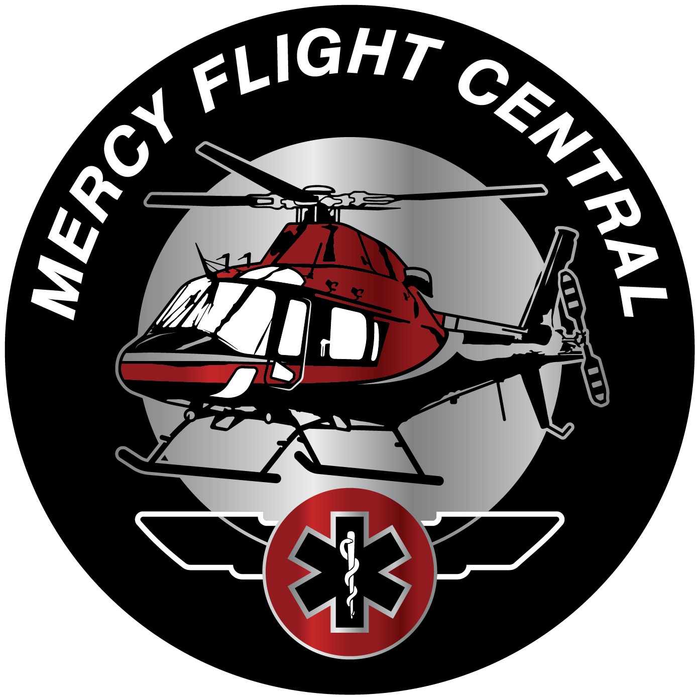
Full Color Emblem
Print (business communications)
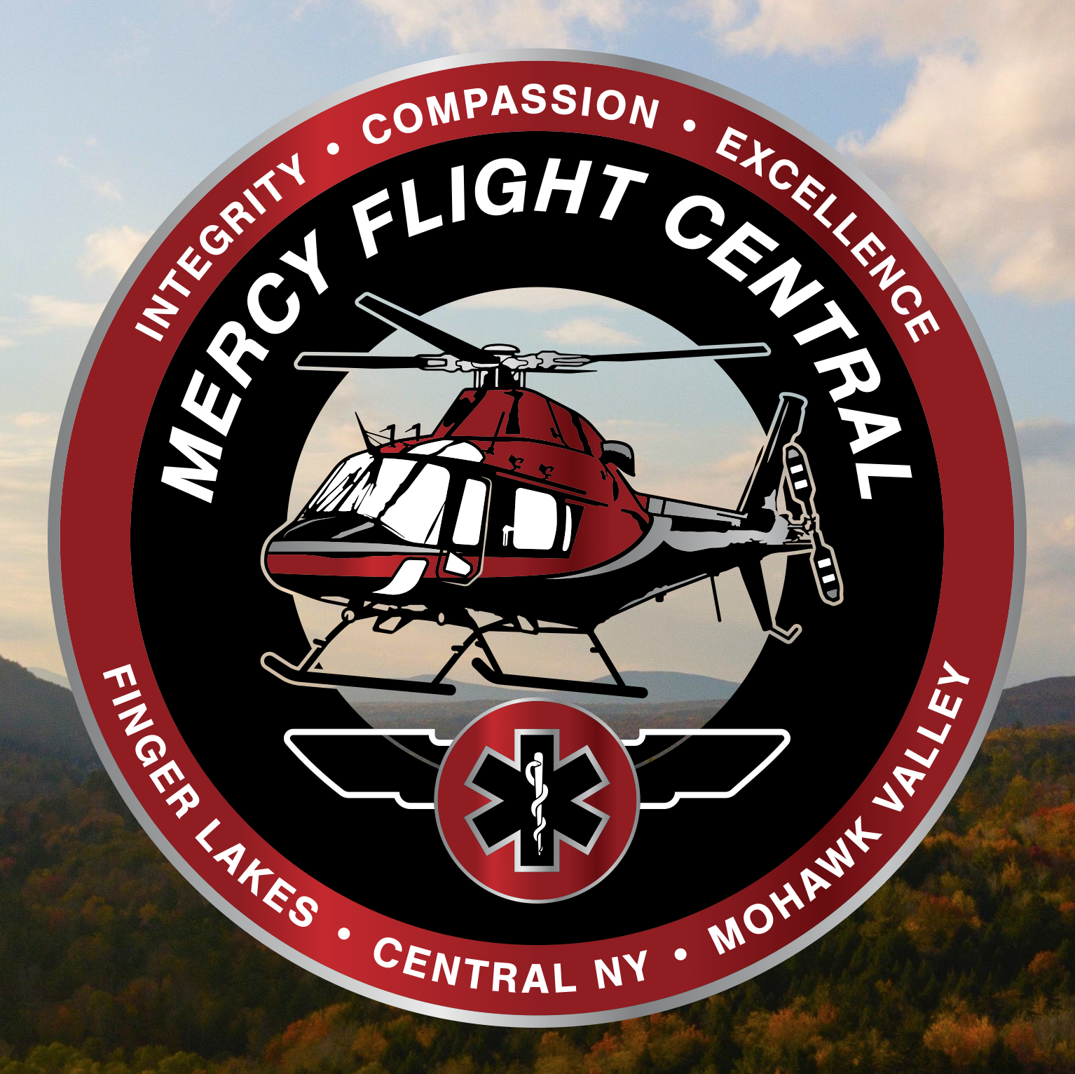
Full Color Gradient Emblem
Digital, Print (donor communications, event signage)
Single Color Emblem
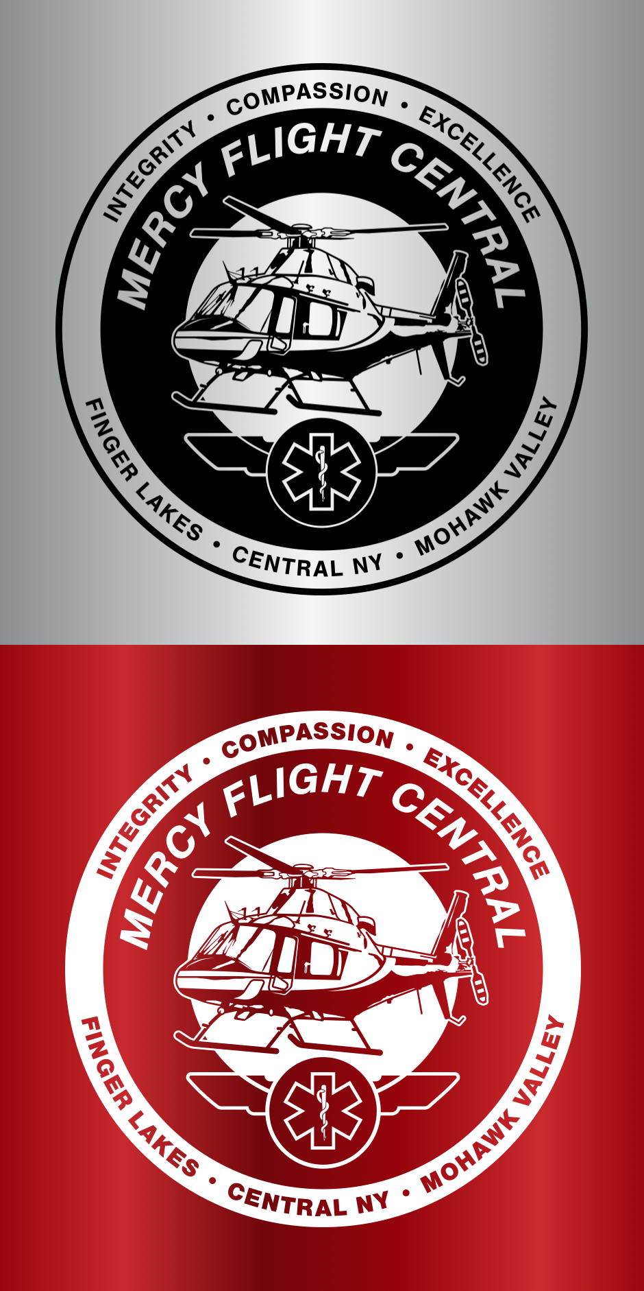
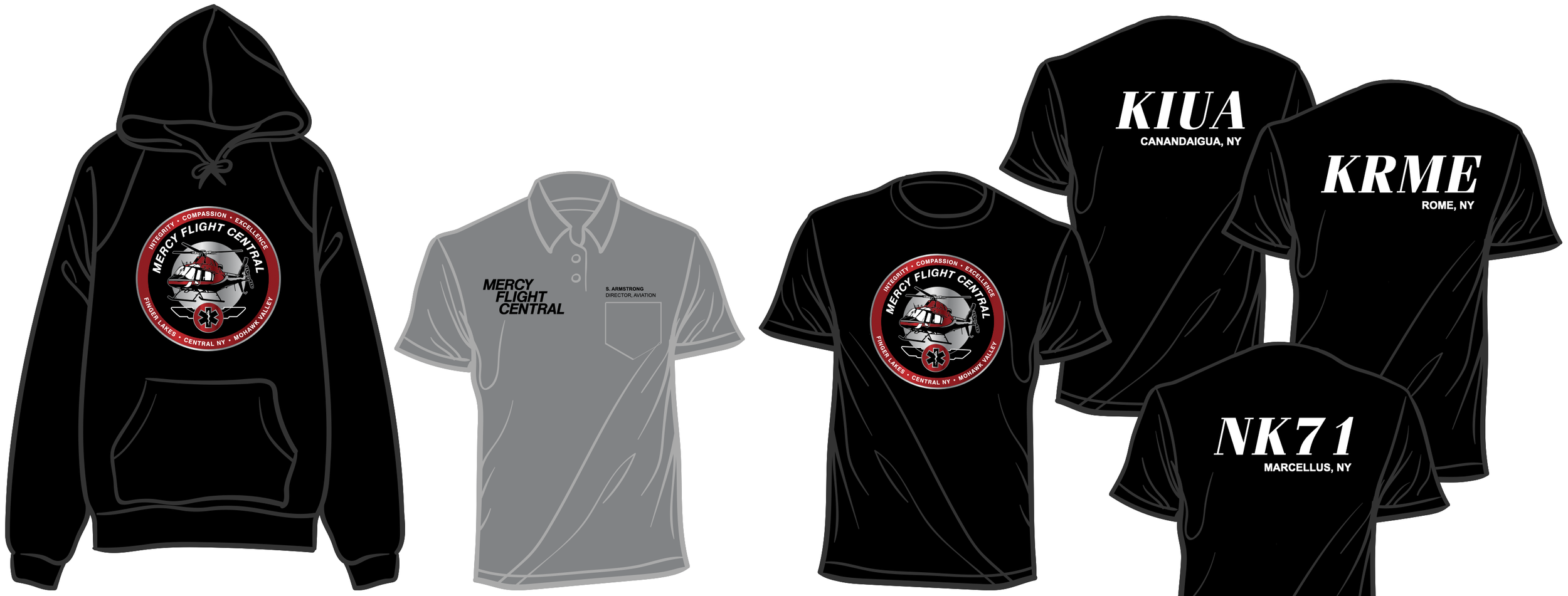
Merchandise, signage where needed
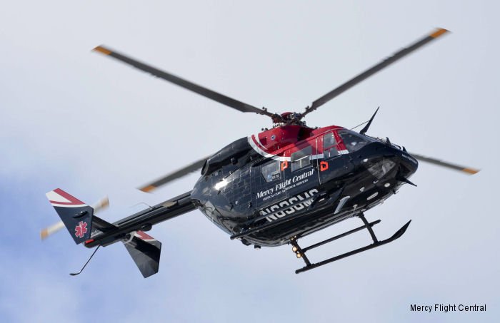
Pilots and leadership alike needed the aircraft in the logo to be clearly recognizable as an AW119kx, not just any helicopter
Clinicians required not only the star of life, which communicates emergency medical services, but also the surrounding aviation wings (signaling the rigorous training needed to be a nurse or paramedic fit for air medical missions)
MFC’s core values––Integrity, Compassion, Excellence-–needed to be present, as they’ve been the compass for each crew for most of the organization’s 30 year history
Including MFC’s regions of service communicated the pride teams have in the communities they’ve served for 3 decades, while also differentiating the organization from Mercy Flight Western
Stacked Logotype

Logotype

A stacked logotype was requested for internal communication, some merchandise, and any other place where the emblem wasn’t appropriate
The direction here came from the AW119kx itself:


Flexible Branding
Knockout Emblem
Over regional photography where appropriate, mainly in donor communications and print marketing pieces
Simplified Emblem
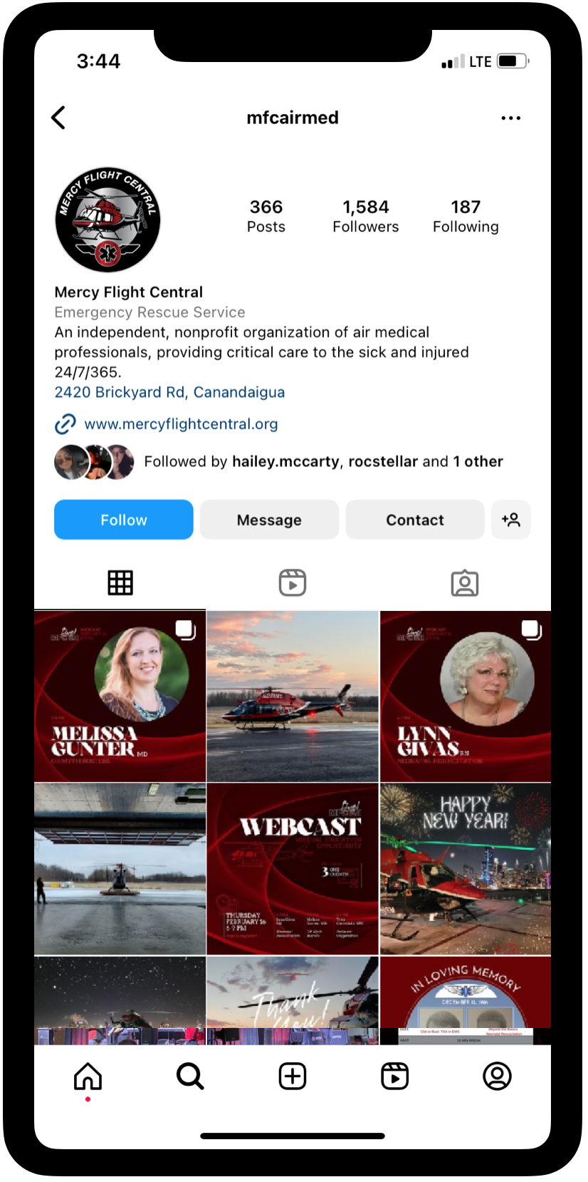
For use across all mobile experiences and social media platforms